Test 2 Production and Consumption
posted by Oil CEO @ 2:05 PM
4 comments
![]()
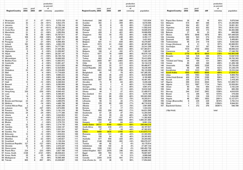
Bringing you thew world of energy consumption. Charts, quotes, links, numbers, Graphs, Investing, Peak Oil, Data, Analysis. Focusing on the countries, the companies, and the people.

4 Comments:
Is this one of the charts you made mention of in a comment to a poster over on The Oil Drum?
Dan Ur,
Yeah. I'm still working on the format. I can't get it to display as a decent sized image where you can read anything, yet. I might have to cut out some countries.
I got the idea when thinking of who would be effected the most by an oil supply/oil export crunch. Turns out the US is dead center in the middle.
I've been browing the table for the last twenty minutes. It's fascinating.
Any chance of getting a table for 2005? I'm particularly interested in what the consumption is for the some of the poorer countries and whether and how much their consumption dropped in the last year because of the high oil prices.
If there's any chance of seeing a thirty or even a forty year chart on consumption per capita of let's say the fifty poorest nations, that might give some insight on why prices don't always reflect how tight markets really are at times. If consumption in poor countries drops, that makes available more oil for wealthier countries but the total effect on the world economy may be getting obscured.
2005 data in this form from EIA doesn't come out until June 2007. BP's is out now, but it doesn't cover anywhere near the amount of countries specifically. BP lumps bunches of them together into regions.
I'll see what I can do about the long-term consumption of 50 poorest.
Post a Comment
<< Home